
| Date | Month | Year | Army | Disease | Wounds | Other | Disease.rate | Wounds.rate | Other.rate |
|---|---|---|---|---|---|---|---|---|---|
| 1854-04-01 | Apr | 1854 | 8571 | 1 | 0 | 5 | 1.4 | 0.0 | 7.0 |
| 1854-05-01 | May | 1854 | 23333 | 12 | 0 | 9 | 6.2 | 0.0 | 4.6 |
| 1854-06-01 | Jun | 1854 | 28333 | 11 | 0 | 6 | 4.7 | 0.0 | 2.5 |
| 1854-07-01 | Jul | 1854 | 28722 | 359 | 0 | 23 | 150.0 | 0.0 | 9.6 |
| 1854-08-01 | Aug | 1854 | 30246 | 828 | 1 | 30 | 328.5 | 0.4 | 11.9 |
| 1854-09-01 | Sep | 1854 | 30290 | 788 | 81 | 70 | 312.2 | 32.1 | 27.7 |
| 1854-10-01 | Oct | 1854 | 30643 | 503 | 132 | 128 | 197.0 | 51.7 | 50.1 |
| 1854-11-01 | Nov | 1854 | 29736 | 844 | 287 | 106 | 340.6 | 115.8 | 42.8 |
| 1854-12-01 | Dec | 1854 | 32779 | 1725 | 114 | 131 | 631.5 | 41.7 | 48.0 |
| 1855-01-01 | Jan | 1855 | 32393 | 2761 | 83 | 324 | 1022.8 | 30.7 | 120.0 |
| 1855-02-01 | Feb | 1855 | 30919 | 2120 | 42 | 361 | 822.8 | 16.3 | 140.1 |
| 1855-03-01 | Mar | 1855 | 30107 | 1205 | 32 | 172 | 480.3 | 12.8 | 68.6 |
| 1855-04-01 | Apr | 1855 | 32252 | 477 | 48 | 57 | 177.5 | 17.9 | 21.2 |
| 1855-05-01 | May | 1855 | 35473 | 508 | 49 | 37 | 171.8 | 16.6 | 12.5 |
| 1855-06-01 | Jun | 1855 | 38863 | 802 | 209 | 31 | 247.6 | 64.5 | 9.6 |
| 1855-07-01 | Jul | 1855 | 42647 | 382 | 134 | 33 | 107.5 | 37.7 | 9.3 |
| 1855-08-01 | Aug | 1855 | 44614 | 483 | 164 | 25 | 129.9 | 44.1 | 6.7 |
| 1855-09-01 | Sep | 1855 | 47751 | 189 | 276 | 20 | 47.5 | 69.4 | 5.0 |
| 1855-10-01 | Oct | 1855 | 46852 | 128 | 53 | 18 | 32.8 | 13.6 | 4.6 |
| 1855-11-01 | Nov | 1855 | 37853 | 178 | 33 | 32 | 56.4 | 10.5 | 10.1 |
| 1855-12-01 | Dec | 1855 | 43217 | 91 | 18 | 28 | 25.3 | 5.0 | 7.8 |
| 1856-01-01 | Jan | 1856 | 44212 | 42 | 2 | 48 | 11.4 | 0.5 | 13.0 |
| 1856-02-01 | Feb | 1856 | 43485 | 24 | 0 | 19 | 6.6 | 0.0 | 5.2 |
| 1856-03-01 | Mar | 1856 | 46140 | 15 | 0 | 35 | 3.9 | 0.0 | 9.1 |
Today, you’ll be making some graphs in Jamovi and Excel/Sheets. You’ll also be playing around a bit with three different datasets. Again, you’ll turn in an “answer sheet” on Brightspace. Please turn that in by next lab You needn’t turn in your data. Just the answer sheet.
Data
You should start by downloading two datasets.
Nightingale data
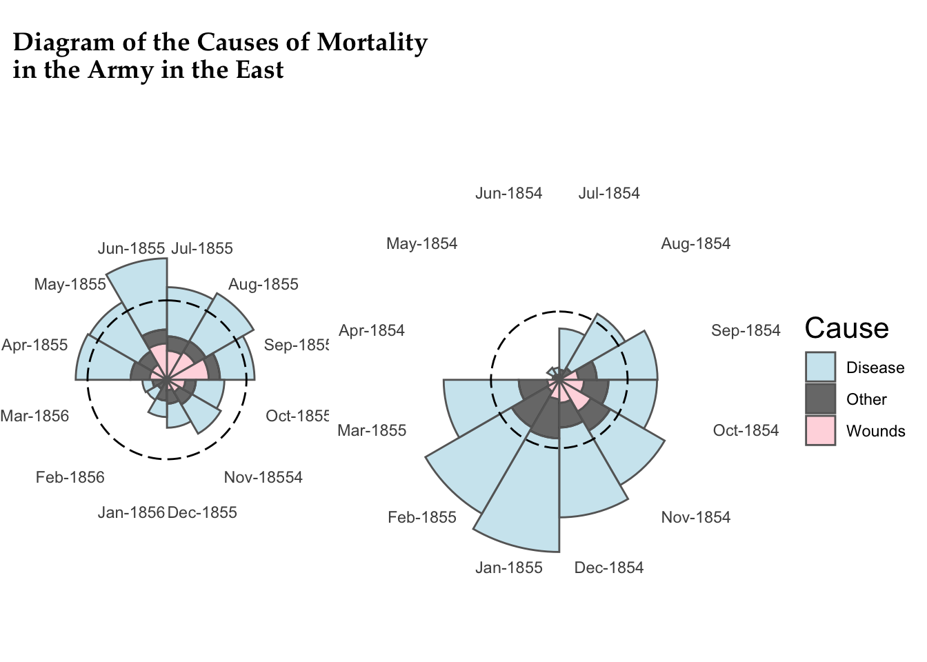
Let’s start by looking at the nightingale data (nightingale.csv), which I also briefly introduced in class. This is the data from Florence Nightingale’s research in the 1850s on causes of death after the Crimean war. Load it into Jamovi.
Modern graphing software can try to do the Nightingale coxcomb plot we saw in class—see it on wikipedia here—but you’ll see that it doesn’t quite look as nice as hers.
Jamovi can’t do a plot like this, but what it can do quite easily is create a histogram.
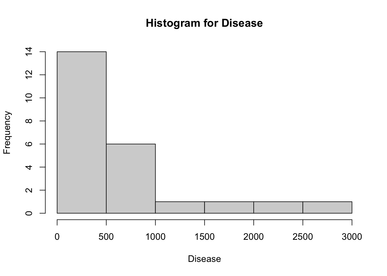
- Create a histogram using the full Disease data. Note that this histogram should only involve the disease data—a histogram shows frequencies of how often you get a certain response. Are these data normally distributed? How do you know? Answer these last two questions on your answer sheet, #1. Your plot should look something like this (although it might not have the title):
Now create a histogram of the deaths from Wounds in the Nightingale data. Is that one normally distributed? (You don’t need to answer on the answer sheet.)
Okay, let’s make a scatterplot. This kind of plot compares two variables to one another—plotting one on the x-axis and the other on the y-axis. There are a few ways to do this in Jamovi, but we’ll use one that’s straightforward to carry out. Select “scatr”: Scatterplot under Analyses: Exploration. (If you don’t have it, install it under Modules; let me know if you need help.)
More info on scatterplots (click to expand)
You can read about scatterplots in Jamovi here. If you need to install it, look on the Analyses ribbon all the way to the right, where there’s a plus sign and the word Modules. You can add a module.
In brief, scatterplots are used to visualize the relationship between two variables which are both numeric. (They’re what you think of as showing correlations.) That’s what we’re doing here. In almost all cases, smaller values are plotted closer to the origin.
If time is one of your variables, it will almost always be on the x-axis.
Plot deaths from Wounds against those from Disease. It’s up to you which is on the x-axis and which on the y. Add Year into the Group box. Can you draw any conclusions from this?
Suppose you wanted to plot cause of death over time for the entirety of the data we have… Line graphs like this are more challenging in Jamovi—feel free to see if you can make one—but you could pretty smoothly make it in Sheets/Excel. In this case, I’ll just include the plot below. Take a look.
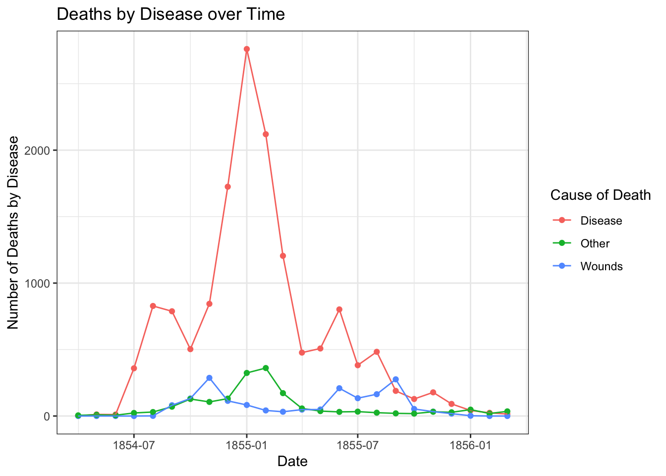
- What conclusions do you draw from this figure? How does it compare to the Nightingale coxcomb diagram above? Include this answer as #2 in your answer sheet.
Teaching and Learning Research
Let’s turn to graphing in Excel/Google Sheets, and use a relatively simple example for this.
Fiorella & Mayer (2013) hypothesized that students would learn course material better if they thought they were going to later be asked teach the material to the rest of the class. To test this, the researchers divided students into three groups. All groups read a short excerpt about the Doppler effect and were later given a 10-question quiz. The control group studied the excerpt and then immediately took the quiz. The preparation group was instructed that they would later teach the material to a group of students. This group also studied the excerpt and then immediately took the quiz. (They did not actually teach.) Finally, the teaching group was instructed that they would later teach the material to a group of students. This group studied the excerpt, actually taught it to a group of students, and then took the quiz. Fiorella & Mayer reported the following results:
| Group | n | Comprehension score | |
|---|---|---|---|
| M | SD | ||
| Control | 31 | 6.2 | 3.3 |
| Preparation | 32 | 7.9* | 2.4 |
| Teaching | 30 | 8.7* | 2.8 |
* Significantly different from control group at p < .05
We’re going to plot these in a bar graph. Open Excel or Google Sheets and copy these data into a table. Make sure that the column headers line up correctly. Before doing anything else, delete the asterisks in your copied data. We want S/E to recognize these as numbers.
Move the n (sample size) values to the far right column, and then delete the empty column that remains. Now, column A should be group, column B should be means, column C should be SD, and column D should be sample size.
Calculate the standard error of the mean or SEM in column E for each group. Remember that \(\textrm{SEM}=\frac{SD}{\sqrt{n}}\). In Sheets or Excel (S/E), remember that an equation starts with = and then refers to the cell names. Square roots are gotten by writing out SQRT(). In cell E7, calculate the average of your SEMs using the =AVERAGE() formula. Your answer should be 0.50938.
Confirm what this should look like (click to expand)
Your spreadsheet columns should look like the below. I’ve added the column (A-E) and row (1-7) as you’ll see in Excel/Sheets, and then the M, SD, n, and SE. The equation for cell E3 is =C3/SQRT(D3), which is then filled down for cells E4 and E5 (=C4/SQRT(D4) and =C5/SQRT(D5)). Finally, in cell E7, I’ve got an average of the three standard errors with =AVERAGE(E3:E5).
| A | B | C | D | E | |
|---|---|---|---|---|---|
| 1 | Comprehension score | ||||
| 2 | Group | M | SD | n | SE |
| 3 | Control | 6.2 | 3.3 | 31 | 0.5926975 |
| 4 | Preparation | 7.9 | 2.4 | 32 | 0.42426407 |
| 5 | Teaching | 8.7 | 2.8 | 30 | 0.51120772 |
| 6 | |||||
| 7 | 0.50938976 |
Select the cells representing the names of the groups (i.e., Control, Preparation, Teaching) and the means (6.2, 7.9, 8.7). This should be cells A3:B5 if you’re following along exactly.
This part I want you to figure out how to do: give the graph a title, label the y-axis, and explore other possible settings, including (e.g.) colors. (You can probably get to the settings for the chart by double-clicking on it or right-clicking.)
Add the error bars we calculated as SEM: this works fully in Excel, but in Sheets we’ll need to only do it halfway.
Submit the plot as part of your Brightspace answer sheet, #3. Chat with a neighbor about what is “lost” by doing this in Sheets vs. Excel. Please copy the chart into your answers or take a screenshot; I’m happy to help you figure that out.
Draw a conclusion from the graph, using the error bars for information. Which method of instruction results in the best scores? What information from the graph makes you feel more confident in that conclusion? Write this answer as #4 on your answer sheet.
I should note: this was only the “immediate test” experiment, which is Experiment 1 in their published article. In Experiment 2, they used a delayed comprehension test. In that test, only the group that actually taught the material did better than the control.
Friends data
Okay, now let’s talk about the data your class collected. You downloaded the cleaned up version of it. Load it into jamovi.
Create a boxplot comparing
gender(on the x-axis) to how many instagram followers our participants have (gram.followers). Submit it as #5 on your answer sheet and comment on whether there are any differences.Create a scatterplot comparing how many hours people use social media (
smed.hours—“How many hours per day do you spend on social media?”) and how many instagram followers they have (gram.followers). Is there a trend? Submit the plot as #6 on your answer sheet.
One-tailed tests
Let’s return to one of the questions from last week, which we discussed as being two-tailed tests… but do this test now as a one-tailed test. (We can go through this quickly since you have the responses from last time already! You can use the mean and standard deviation you found in #5 last class as the \(\mu\) and \(\sigma\) for your population. Want to find them again? Use the variable height at the very end of the cleaned friends data.)
Let’s take a new person—5′1″ in height—and ask: Would this person be considered “significantly short” compared to other Bard students? Imagine in this case that we don’t care whether they’re on the tall side, so we don’t need to use a two-tailed test.
We’re still using the z-distribution, but now we’re only interested in scores that fall in the lower 5% of the distribution—where 95% of the scores are higher:
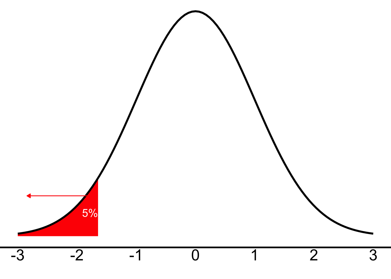
And just as we discussed in class, our cut-off (the critical z-score or \(z_{crit}\)) will be +1.64 for the right side (are they taller?) or, in this case, -1.64 for the left side (are they shorter?). Any z-score below (more negative) than -1.64 will be “unlikely” and let us know that \(p<.05\)—i.e., if the z we calculate has a greater magnitude (more negative) than -1.64, we will conclude that there is statistical significance and reject the null hypothesis.
Why 1.64 instead of 1.96? (click to expand)
Why 1.64 instead of 1.96? Well, \(\pm{}1.96\) corresponded to 2.5% in either tail (i.e., a total of 5% across both tails), and 1.64 corresponds to 5% just in one tail. Feel free to look at the z-table on Brightspace to confirm that.
- Carry out the test, using the person who’s 5′1″ as your X score and the mean and standard deviation of height as your \(\mu\) and \(\sigma\). You should (conceptually) use the steps of hypothesis-testing, but you only need to report the z-score and your conclusion about the null hypothesis. This is answer #7.
Testing means of samples
In class, we discussed the idea of hypothesis testing with means of samples. We explored the rules that we get from the Central Limit Theorem. Now is a great time to play around with the tool I showed you in class. As you’ll recall, we conclude the following from the Central Limit Theorem:
For random samples of size n, selected from a population with mean \(\mu\) and standard deviation \(\sigma\), has…
- a mean, \(\mu_X\), equal to the mean of the population: \(\mu_X=\mu\) regardless of size n of the sample
- a standard deviation, \(\sigma_X\), equal to the standard deviation of the population divided by the square root of the sample size: \(\sigma_X=\frac{\sigma}{\sqrt{n}}\)—this is the Standard Error of the Mean (SEM) and will be described by this equation regardless of size n of the sample, and
- a shape that is normal if the population is normal AND, for populations with finite mean and variance, the shape becomes more normal as sample size n increases
Suppose I tell you that we know something about all Bard students (our population—and yes, I’m making this up): The average number of classes taken is \(\mu=4.00\), with a standard deviation of \(\sigma=0.25\). From the above, you should be able to determine the properties of the sampling distribution. (You want to have your n equal to the number of people in our sample for whom we have an answer for the variable numclasses. Jamovi will easily give you this n as well as the mean of numclasses.)
To calculate a z test with means of samples, we’re going to use the formula you were introduced to in class for a z-test with means of samples. When we know the population mean and standard deviation (which we do here—I gave them to you above), we can calculate the z-score for a sample as \(z=\frac{(M-\mu_X)}{\sigma_X}\) (where M is our sample mean, \(\mu_X\) is the mean of the sampling distribution and equivalent to the population mean, and \(\sigma_X\) is the standard error of the mean, \(\sigma_X=\frac{\sigma}{\sqrt{n}}\)).
- For answer #8, determine the properties of the comparison distribution, and then calculate the z-score for our sample’s mean number of classes. Does our sample differ from the population mean? Feel free to use the steps of hypothesis-testing, or just let me know (a) the sampling distribution’s properties (describe it based on the central limit theorem), (b) the z-score for our sample, and (c) the conclusion you reach about the null hypothesis.
Reuse
Citation
BibTeX citation:
@online{dainer-best2025,
  author = {Dainer-Best, Justin},
  title = {Visual {Displays} of {Information} {(Lab} 4)},
  date = {2025-09-25},
  url = {https://faculty.bard.edu/jdainerbest/stats/labs/posts/04-visualizations-and-hypothesis-tests/},
  langid = {en}
}
For attribution, please cite this work as:
Dainer-Best, Justin. 2025. “Visual Displays of Information (Lab
4).” September 25, 2025. https://faculty.bard.edu/jdainerbest/stats/labs/posts/04-visualizations-and-hypothesis-tests/.