
| Month | Date | Two.weeks.prior.to.outbreak.only | Nationwide.Republican.Support | Nationwide.Democratic.Support | Voter.Intention.Index | Voter.Intention.Change.Index | Daily.Ebola.Search.Volume | Ebola.Search.Volume.Index | Daily.ISIS.Search.Volume | ISIS.Search.Volume.Index | DJIA | LexisNexisNewsVolume | LexisNexisNewsVolumeWeek | filter_. | time |
|---|---|---|---|---|---|---|---|---|---|---|---|---|---|---|---|
| 9 | 1 | 0 | NA | NA | NA | NA | 3 | 2.86 | 14 | NA | NA | 23 | 37.57 | 1 | 2014-09-01 |
| 9 | 2 | 0 | NA | NA | NA | NA | 5 | 3.14 | 37 | NA | 17067.56 | 38 | 34.86 | 1 | 2014-09-02 |
| 9 | 3 | 0 | NA | NA | NA | NA | 6 | 3.57 | 48 | NA | 17078.28 | 52 | 36.43 | 1 | 2014-09-03 |
| 9 | 4 | 0 | NA | NA | NA | NA | 4 | 3.71 | 37 | NA | 17069.58 | 50 | 37.14 | 1 | 2014-09-04 |
| 9 | 5 | 0 | NA | NA | NA | NA | 4 | 3.86 | 27 | NA | 17137.36 | 51 | 40.00 | 1 | 2014-09-05 |
| 9 | 6 | 0 | NA | NA | NA | NA | 3 | 3.57 | 23 | NA | NA | 31 | 38.86 | 1 | 2014-09-06 |
| 9 | 7 | 0 | 43.7 | 42.3 | 1.4 | NA | 3 | 4.00 | 24 | 30.000000 | NA | 23 | 38.29 | 1 | 2014-09-07 |
| 9 | 8 | 0 | NA | NA | NA | NA | 3 | 4.00 | 23 | 31.285714 | 17111.42 | 30 | 39.29 | 1 | 2014-09-08 |
| 9 | 9 | 0 | 43.7 | 42.5 | 1.2 | NA | 4 | 3.86 | 19 | 28.714286 | 17013.87 | 74 | 44.43 | 1 | 2014-09-09 |
| 9 | 10 | 0 | NA | NA | NA | NA | 3 | 3.43 | 27 | 25.714286 | 17068.71 | 42 | 43.00 | 1 | 2014-09-10 |
| 9 | 11 | 0 | NA | NA | NA | NA | 3 | 3.29 | 100 | 34.714286 | 17049.00 | 32 | 40.43 | 1 | 2014-09-11 |
| 9 | 12 | 0 | NA | NA | NA | NA | 3 | 3.14 | 36 | 36.000000 | 16987.51 | 52 | 40.57 | 1 | 2014-09-12 |
| 9 | 13 | 0 | NA | NA | NA | NA | 3 | 3.14 | 25 | 36.285714 | NA | 29 | 40.29 | 1 | 2014-09-13 |
| 9 | 14 | 0 | 43.9 | 42.9 | 1.0 | -0.4 | 2 | 3.00 | 52 | 40.285714 | NA | 29 | 41.14 | 1 | 2014-09-14 |
| 9 | 15 | 0 | NA | NA | NA | NA | 3 | 3.00 | 28 | 41.000000 | 17031.14 | 40 | 42.57 | 1 | 2014-09-15 |
| 9 | 16 | 0 | NA | NA | NA | NA | 5 | 3.14 | 23 | 41.571429 | 17131.97 | 89 | 44.71 | 1 | 2014-09-16 |
| 9 | 17 | 0 | NA | NA | NA | NA | 6 | 3.57 | 19 | 40.428571 | 17156.85 | 128 | 57.00 | 1 | 2014-09-17 |
| 9 | 18 | 0 | 43.8 | 43.2 | 0.6 | NA | 3 | 3.57 | 22 | 29.285714 | 17265.99 | 140 | 72.43 | 1 | 2014-09-18 |
| 9 | 19 | 0 | NA | NA | NA | NA | 4 | 3.71 | 18 | 26.714286 | 17279.74 | 71 | 75.14 | 1 | 2014-09-19 |
| 9 | 20 | 0 | NA | NA | NA | NA | 2 | 3.57 | 13 | 25.000000 | NA | 57 | 79.14 | 1 | 2014-09-20 |
| 9 | 21 | 0 | 43.7 | 43.3 | 0.4 | -0.6 | 2 | 3.57 | 16 | 19.857143 | NA | 36 | 80.14 | 1 | 2014-09-21 |
| 9 | 22 | 0 | NA | NA | NA | NA | 3 | 3.57 | 16 | 18.142857 | 17172.68 | 85 | 86.57 | 1 | 2014-09-22 |
| 9 | 23 | 0 | NA | NA | NA | NA | 4 | 3.43 | 33 | 19.571429 | 17055.87 | 74 | 84.43 | 1 | 2014-09-23 |
| 9 | 24 | 1 | NA | NA | NA | NA | 4 | 3.14 | 24 | 20.285714 | 17210.06 | 90 | 79.00 | 1 | 2014-09-24 |
| 9 | 25 | 1 | 43.1 | 43.5 | -0.4 | -1.0 | 4 | 3.29 | 22 | 20.285714 | 16945.80 | 92 | 72.14 | 1 | 2014-09-25 |
| 9 | 26 | 1 | NA | NA | NA | NA | 4 | 3.29 | 22 | 20.857143 | 17113.15 | 113 | 78.14 | 1 | 2014-09-26 |
| 9 | 27 | 1 | NA | NA | NA | NA | 3 | 3.43 | 15 | 21.142857 | NA | 69 | 79.86 | 1 | 2014-09-27 |
| 9 | 28 | 1 | 43.3 | 43.6 | -0.3 | -0.7 | 6 | 4.00 | 14 | 20.857143 | NA | 57 | 82.86 | 1 | 2014-09-28 |
| 9 | 29 | 1 | 43.4 | 43.6 | -0.2 | NA | 5 | 4.29 | 13 | 20.428571 | 17071.22 | 55 | 78.57 | 1 | 2014-09-29 |
| 9 | 30 | 1 | 43.5 | 43.6 | -0.1 | NA | 22 | 6.86 | 11 | 17.285714 | 17042.90 | 57 | 76.14 | 1 | 2014-09-30 |
| 10 | 1 | 1 | NA | NA | NA | NA | 50 | 13.43 | 10 | 15.285714 | 16804.71 | 197 | 91.43 | 0 | 2014-10-01 |
| 10 | 2 | 1 | 43.8 | 43.7 | 0.1 | 0.5 | 68 | 22.57 | 8 | 13.285714 | 16801.05 | 298 | 120.86 | 0 | 2014-10-02 |
| 10 | 3 | 1 | NA | NA | NA | NA | 66 | 31.43 | 8 | 11.285714 | 17009.69 | 237 | 138.57 | 0 | 2014-10-03 |
| 10 | 4 | 1 | NA | NA | NA | NA | 52 | 38.43 | 11 | 10.714286 | NA | 160 | 151.57 | 0 | 2014-10-04 |
| 10 | 5 | 1 | 44.3 | 43.6 | 0.7 | 1.0 | 41 | 43.43 | 9 | 10.000000 | NA | 125 | 161.29 | 0 | 2014-10-05 |
| 10 | 6 | 1 | 44.4 | 43.6 | 0.8 | 1.0 | 43 | 48.86 | 9 | 9.428571 | 16991.91 | 118 | 170.29 | 0 | 2014-10-06 |
| 10 | 7 | 1 | 44.5 | 43.5 | 1.0 | 1.1 | 35 | 50.71 | 9 | 9.142857 | 16719.39 | 186 | 188.71 | 0 | 2014-10-07 |
| 10 | 8 | 0 | NA | NA | NA | NA | 52 | 51.00 | 9 | 9.000000 | 16994.22 | 208 | 190.29 | 0 | 2014-10-08 |
| 10 | 9 | 0 | 44.6 | 43.5 | 1.1 | 1.0 | 57 | 49.43 | 9 | 9.142857 | 16695.25 | 314 | 192.57 | 0 | 2014-10-09 |
| 10 | 10 | 0 | NA | NA | NA | NA | 62 | 48.86 | 7 | 9.000000 | 16544.10 | 250 | 194.43 | 0 | 2014-10-10 |
| 10 | 11 | 0 | NA | NA | NA | NA | 37 | 46.71 | 9 | 8.714286 | NA | 175 | 196.57 | 0 | 2014-10-11 |
| 10 | 12 | 0 | 44.7 | 43.4 | 1.3 | 0.6 | 51 | 48.14 | 10 | 8.857143 | NA | 157 | 201.14 | 0 | 2014-10-12 |
| 10 | 13 | 0 | NA | NA | NA | NA | 57 | 50.14 | 8 | 8.714286 | 16321.07 | 315 | 229.29 | 0 | 2014-10-13 |
| 10 | 14 | 0 | 44.9 | 43.5 | 1.4 | 0.4 | 57 | 53.29 | 7 | 8.428571 | 16315.19 | 322 | 248.71 | 0 | 2014-10-14 |
| 10 | 15 | 0 | NA | NA | NA | NA | 92 | 59.00 | 8 | 8.285714 | 16141.74 | 353 | 269.43 | 0 | 2014-10-15 |
| 10 | 16 | 0 | 45.1 | 43.5 | 1.6 | 0.5 | 100 | 65.14 | 6 | 7.857143 | 16117.24 | 512 | 297.71 | 0 | 2014-10-16 |
| 10 | 17 | 0 | NA | NA | NA | NA | 83 | 68.14 | 7 | 7.857143 | 16380.41 | 583 | 345.29 | 0 | 2014-10-17 |
| 10 | 18 | 0 | NA | NA | NA | NA | 56 | 70.86 | 6 | 7.428571 | NA | 402 | 377.71 | 0 | 2014-10-18 |
| 10 | 19 | 0 | NA | NA | NA | NA | 38 | 69.00 | 5 | 6.714286 | NA | 269 | 393.71 | 0 | 2014-10-19 |
| 10 | 20 | 0 | 45.4 | 43.5 | 1.9 | NA | 35 | 65.86 | 5 | 6.285714 | 16399.67 | 384 | 403.57 | 0 | 2014-10-20 |
| 10 | 21 | 0 | 45.5 | 43.5 | 2.0 | 0.6 | 40 | 63.43 | 5 | 6.000000 | 16614.81 | 359 | 408.86 | 0 | 2014-10-21 |
| 10 | 22 | 0 | NA | NA | NA | NA | 28 | 54.29 | 4 | 5.428571 | 16461.32 | 327 | 405.14 | 0 | 2014-10-22 |
| 10 | 23 | 0 | 45.6 | 43.5 | 2.1 | 0.5 | 22 | 43.14 | 6 | 5.428571 | 16677.90 | 273 | 371.00 | 0 | 2014-10-23 |
| 10 | 24 | 0 | NA | NA | NA | NA | 48 | 38.14 | 5 | 5.142857 | 16805.41 | 388 | 343.14 | 0 | 2014-10-24 |
| 10 | 25 | 0 | NA | NA | NA | NA | 25 | 33.71 | 4 | 4.857143 | NA | 302 | 328.86 | 0 | 2014-10-25 |
| 10 | 26 | 0 | 45.7 | 43.5 | 2.2 | NA | 20 | 31.14 | 4 | 4.714286 | NA | 197 | 318.57 | 0 | 2014-10-26 |
| 10 | 27 | 0 | 45.8 | 43.5 | 2.3 | 0.4 | 23 | 29.43 | 4 | 4.571429 | 16817.94 | 294 | 305.71 | 0 | 2014-10-27 |
| 10 | 28 | 0 | NA | NA | NA | NA | 24 | 27.14 | 3 | 4.285714 | 17005.75 | 327 | 301.14 | 0 | 2014-10-28 |
| 10 | 29 | 0 | NA | NA | NA | NA | 22 | 26.29 | 4 | 4.285714 | 16974.31 | 259 | 291.43 | 0 | 2014-10-29 |
| 10 | 30 | 0 | 45.9 | 43.6 | 2.3 | 0.2 | 18 | 25.71 | 4 | 4.000000 | 17195.42 | 293 | 294.29 | 0 | 2014-10-30 |
| 10 | 31 | 0 | NA | NA | NA | NA | 16 | 21.14 | 4 | 3.857143 | 17390.52 | 281 | 279.00 | 0 | 2014-10-31 |
| 11 | 1 | 0 | 46.0 | 43.6 | 2.4 | NA | 11 | 19.14 | 3 | 3.714286 | NA | 218 | 267.00 | 0 | 2014-11-01 |
| 11 | 2 | 0 | NA | NA | NA | NA | 11 | 17.86 | 4 | 3.714286 | NA | 150 | 260.29 | 0 | 2014-11-02 |
| 11 | 3 | 0 | NA | NA | NA | NA | 36 | 19.71 | 4 | 3.714286 | 17366.24 | 214 | 248.86 | 0 | 2014-11-03 |
| 11 | 4 | 0 | NA | NA | NA | NA | 15 | 18.43 | 4 | 3.857143 | 17383.84 | 118 | 219.00 | 0 | 2014-11-04 |
Objectives
Today’s lab’s objectives are to:
- Learn about regressions and correlations
- Do some basic plotting relating to them
- Learn how to conduct a regression and a correlation in Jamovi
You’ll turn in an “answer sheet” on Brightspace. Please turn that in by the beginning of next lab.
There are two sets of questions today! First do a “tutorial” and then play around with two datasets.
Correlations and regressions
A correlation examines the relationship between two numeric variables, while a regression lets us predict a score on an outcome (criterion) variable from one or multiple predictors. The latter is also the statistical procedure for finding the best-fitting linear line to aid in that prediction.
Regressions and correlations by definition use two, paired numeric variables. There must be some specific relationship between them.
A first example
For one example, let’s look at data from Beall, Hofer, & Shaller (2016). The article is:
Beall, A. T., Hofer, M. K., & Shaller, M. (2016). Infections and elections: Did an Ebola outbreak influence the 2014 U.S. federal elections (and if so, how)? Psychological Science, 27, 595-605. https://doi.org/10.1177/0956797616628861
(Thanks to Kevin P. McIntyre’s curation of this data.)
The experiment
Beall, Hofer, and Schaller (2016) wanted to determine whether the outbreak of Ebola in 2014 increased support for more conservative electoral candidates. They didn’t look at people in particular—they looked at the frequency of web searches for the term “Ebola” before and after the outbreak, and they looked at polls on support for Republicans and Democrats in their U.S. House of Representatives races during the same time.
Their data is thus paired by date—it’s not paired by the individual like much of the work we’re interested in is.
The researchers asked: is the psychological salience of Ebola associated with an increased intention to vote for Republican candidates?
Read the question below, and decide what you think before clicking for the answer.
NoteWhat is the framing of this question for a research hypothesis and a null hypothesis?
Research hypothesis: There is some relationship (\(r\neq0\)) between Ebola searches and conservative voting intentions
Null hypothesis: There is no relationship (\(r=0\)) between Ebola searches and conservative voting intentions
By definition, we almost always just say “not equal” rather than \(r>0\) or \(r<0\), which means we’re defaulting to a 2-tailed hypothesis.
Explore these data
Scroll through the data briefly (up and down or right-to-left).
You can use the above interface to look through the data. There are several variables and several NAs. You’ll get to look at some of the other variables later, but for the moment, we’re going to look at the Voter.Intention.Index and the Ebola.Search.Volume.Index—you can read the paper for more info, but these two have been created as indexes of the main ideas.
- The
Voter.Intention.Indexis created as the difference between the percentage of voters who planned to vote for a Democrat and those who intended to vote for a Republican; thus a positive value indicates preference for Republican candidates. - The
Ebola.Search.Volume.Indexinvolves online searches for the term “Ebola”.
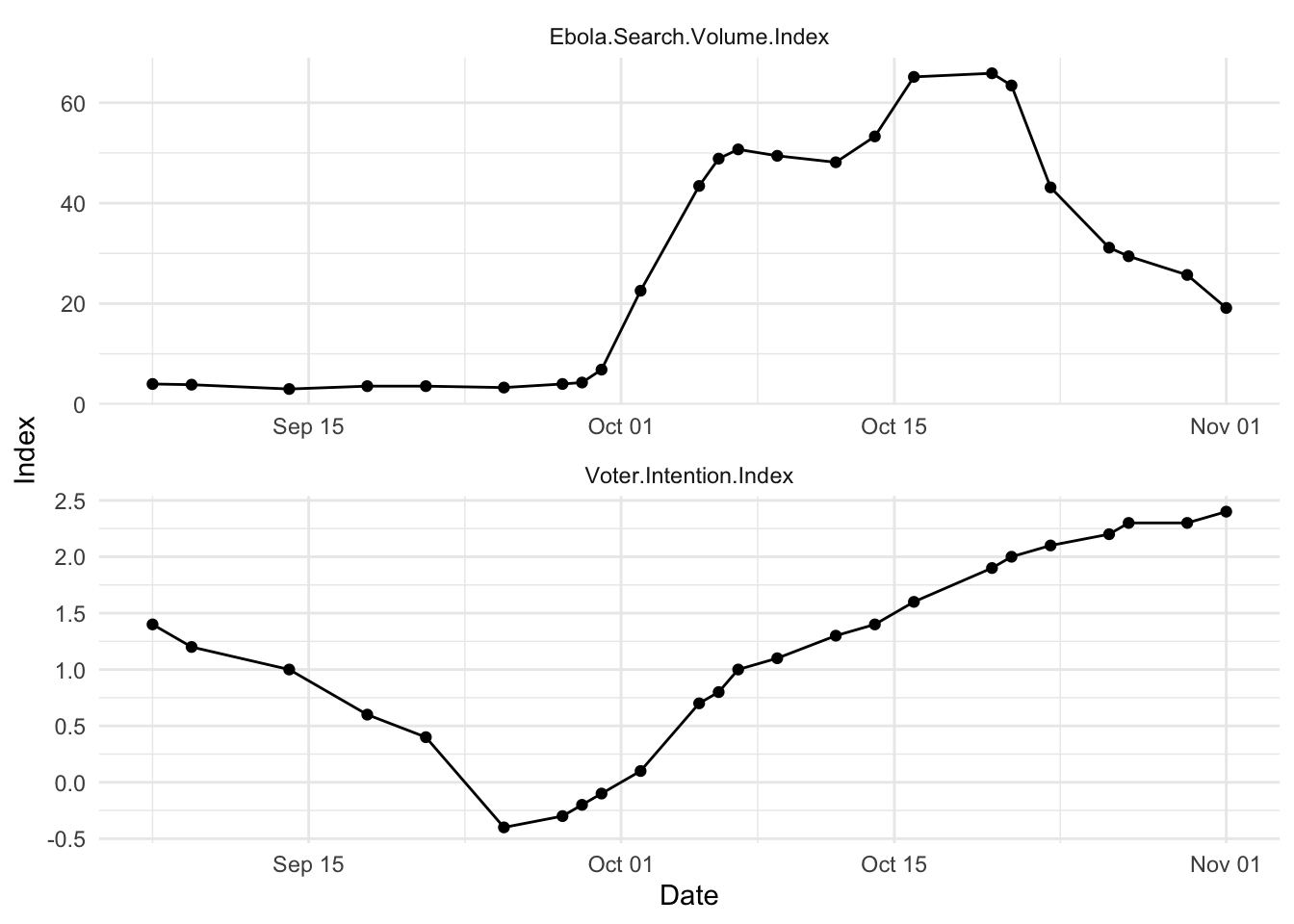
Let’s start by looking at the way they changed over time. Take a look at the image below.
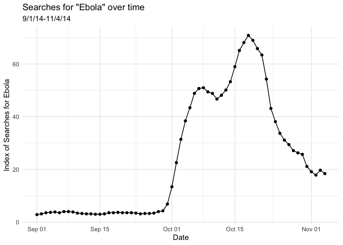
NoteWhat do you see in the plot? Think through or discuss with a classmate, then click for more
My conclusion: there were rare searches for the term “Ebola” for much of early September, 2014, and then a significant increase in early October of 2014, followed by a decline after the peak in mid-October. Why do you think this might have been? There’s a wikipedia article about the 2014 events; you can read it if you’re curious.
On another side of things, an index of a variety of polls conducted on several days shows voters intentions over that same period. (You’ll note that there are fewer points.) What do you see?
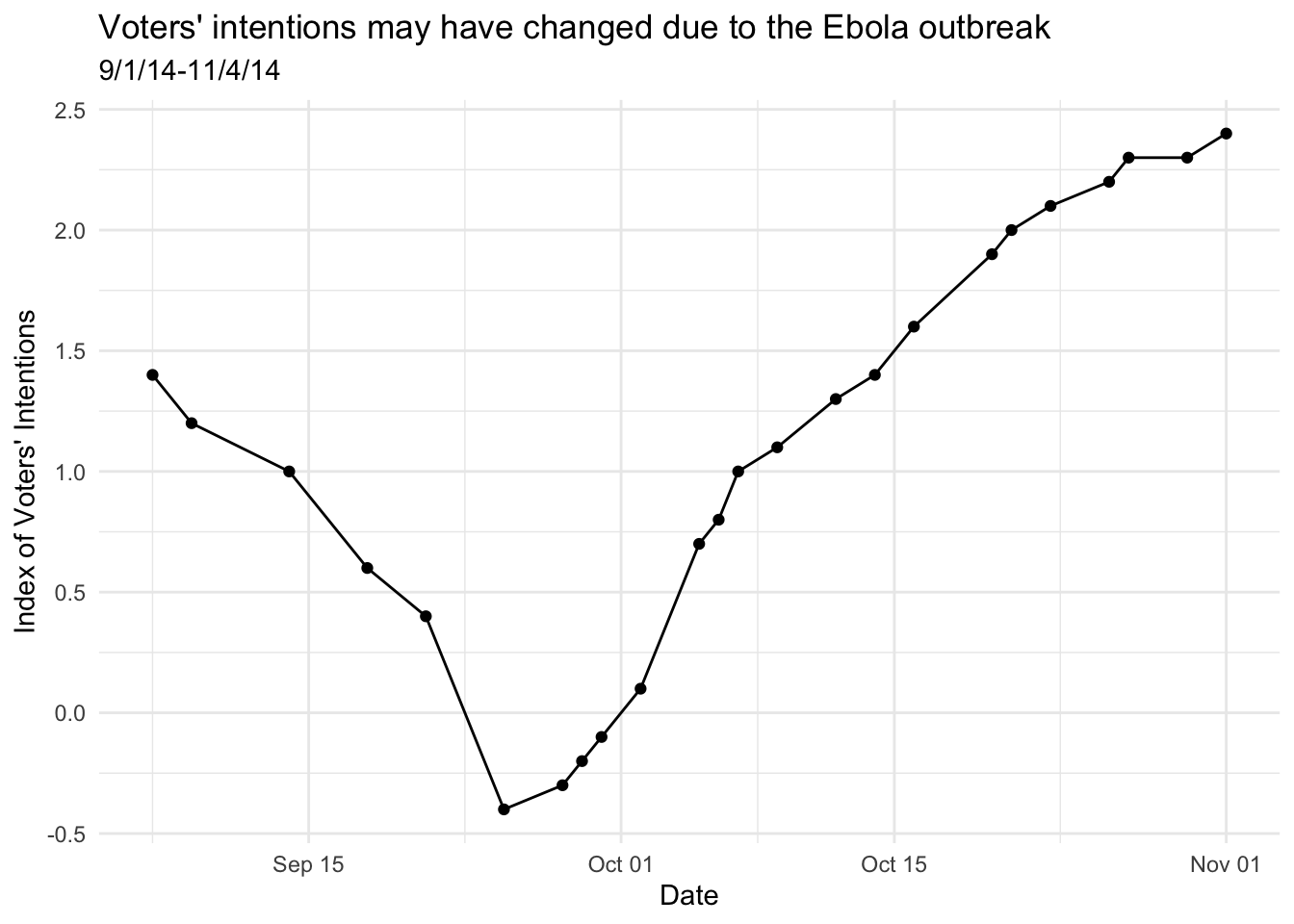
NoteWhat do you see in the plot? Think through or discuss with a classmate, then click to view
My conclusion: Voter intentions changed in sort of the same timeline, but in the opposite direction. (And maybe at a slightly different timeline?) Higher scores here mean a larger chance of voting for Republican (than Democrat) candidates. So from shortly before October 1, polls showed an increase in likelihood of voting for Republicans.
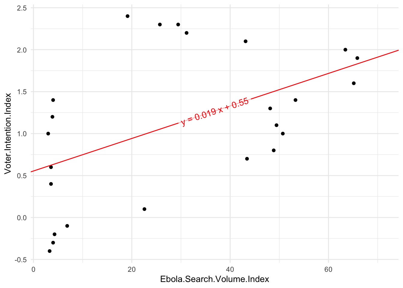
You may say: okay, but the correlation we’re interested in is not between these variables and the date, but rather with each other—and you’re quite right. One way to look at these together is to plot them against one another. This would be a scatterplot!
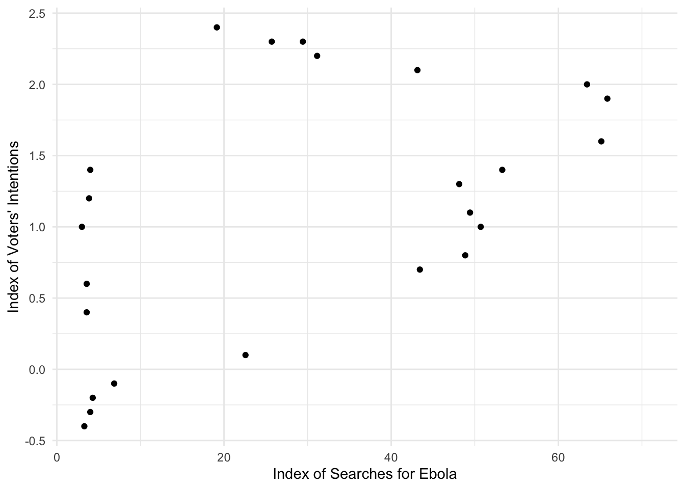
NoteDo you think there’s a pattern here? Where would the line of best fit go? Is there a correlation? Click through to see the line
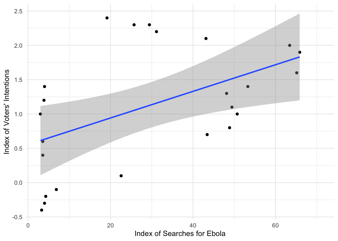
Yes, it looks like there may be a linear correlation. The gray area represents the confidence interval—yep, like the 95% confidence intervals we’ve discussed. The blue line is the line of best fit—the regression line.
You’ll also see that a correlation doesn’t actually care about date. It’s just pairing the two variables based on something they have in common. There are analyses which would take the date into account (or at least think about time as linear), but that’s more complex than what we’re doing today.
I hope that you can see that there’s probably some connection between these points, but one more thing we could do is plot them against each other over time. As I said in the “info” note above, this isn’t necessarily what a correlation is testing, but let’s take a look.
Again, discuss with a classmate. Do you think there’s a correlation over time? From this, do you think there’s a date-based pattern? Do these rise and fall together?
We can run some correlations here, but I think it’s important to think a bit about whether this is really the right test. What does it mean to just look at these variables, irrespective of time? Time seems important! That said, let’s run the correlations.
Running correlations
Are Ebola.Search.Volume.Index and Voter.Intention.Index correlated in a statistically-significant way?
Jamovi’s results will give a table that looks something like this:
| Ebola.Search.Volume.Index | |
|---|---|
| Pearson's r | 0.505 |
| df | 22.000 |
| p-value | 0.012 |
NoteIs the result of the correlation statistically significant?
Yes, it is statistically significant because \(p<.05\)
The test shows a p-value of 0.012; this is less than .05 and therefore you should reject the null hypothesis. The correlation is statistically-significant.
In class, we talked about the technical formula for a Pearson’s correlation. Although as I said in class, you won’t need to calculate this, this is a formula you could use to calculate the correlation coefficient by hand.
\[r=\frac{\sum{z_X\times{}z_Y}}{N-1}\]
This is “the average of the sum of the product of the z-scores”. And yes, it’s \(N-1\) on the bottom.
We can do the summed product of z-scores with these data. The mean of Ebola.Search.Volume.Index is 28.99 and the mean of Voter.Intention.Index is 1.12. We can use the formula of \(z=\frac{X-M}{SD}\) to calculate all the z-scores, and their products (\(z_X\times{}z_Y\)). I’m not going to force you to do it yourself in Google Sheets or Excel (although obviously you’re welcome to do so); I’ve done it below.
| Ebola.Search.Volume.Index | Voter.Intention.Index | z_search | z_intention | z_product |
|---|---|---|---|---|
| 4.00 | 1.4 | -1.08234694 | 0.31980326 | -0.34613808 |
| 3.86 | 1.2 | -1.08840950 | 0.09405978 | -0.10237556 |
| 3.00 | 1.0 | -1.12565092 | -0.13168370 | 0.14822987 |
| 3.57 | 0.6 | -1.10096766 | -0.58317065 | 0.64205203 |
| 3.57 | 0.4 | -1.10096766 | -0.80891413 | 0.89058830 |
| 3.29 | -0.4 | -1.11309277 | -1.71188805 | 1.90549021 |
| 4.00 | -0.3 | -1.08234694 | -1.59901631 | 1.73069041 |
| 4.29 | -0.2 | -1.06978879 | -1.48614457 | 1.58986080 |
| 6.86 | -0.1 | -0.95849755 | -1.37327283 | 1.31627865 |
| 22.57 | 0.1 | -0.27819200 | -1.14752935 | 0.31923348 |
| 43.43 | 0.7 | 0.62512907 | -0.47029891 | -0.29399752 |
| 48.86 | 0.8 | 0.86026969 | -0.35742717 | -0.30748376 |
| 50.71 | 1.0 | 0.94038206 | -0.13168370 | -0.12383298 |
| 49.43 | 1.1 | 0.88495296 | -0.01881196 | -0.01664770 |
| 48.14 | 1.3 | 0.82909082 | 0.20693152 | 0.17156503 |
| 53.29 | 1.4 | 1.05210633 | 0.31980326 | 0.33646704 |
| 65.14 | 1.6 | 1.56525852 | 0.54554674 | 0.85392168 |
| 65.86 | 1.9 | 1.59643738 | 0.88416196 | 1.41150920 |
| 63.43 | 2.0 | 1.49120871 | 0.99703370 | 1.48678533 |
| 43.14 | 2.1 | 0.61257091 | 1.10990544 | 0.67989579 |
| 31.14 | 2.2 | 0.09292313 | 1.22277718 | 0.11362428 |
| 29.43 | 2.3 | 0.01887332 | 1.33564892 | 0.02520813 |
| 25.71 | 2.3 | -0.14221749 | 1.33564892 | -0.18995264 |
| 19.14 | 2.4 | -0.42672466 | 1.44852065 | -0.61811948 |
I’ve filtered to only the rows where we don’t have NAs, and then found the means and SD s, from which we can find the z-scores and the product of them (the first z-score multiplied by the second). Scroll through these data and take a look. The first two z-columns are for Ebola.Search.Volume.Index and Voter.Intention.Index, and then the third is z_product and is those two times one another.
If we then take the sum of those products (i.e., add up everything in the final column), we get 11.62. If we take that divided by \(N-1\) (which is the number of rows for which we have data, here 24, with one subtracted from it to get the \(df=N-1\), therefore 23), we get \(\frac{11.62}{23}=0.505\). That’s exactly what we got in Jamovi.
We can test how likely it is that we’d find an answer like that, too. Your textbook explains that the way we test an r-value is by using this equation for t:
\[t=\frac{(r)\sqrt{N-2}}{\sqrt{1-r^2}}\]
(I showed this in class, too.) That \(N-2\) is where the degrees of freedom comes from for this test—one point lost for each variable. We can calculate that t. We know that \(r=0.505\) and \(N=24\). So if we plug those in, \(t=\frac{(0.505)\sqrt{24-2}}{\sqrt{1-0.505^2}}\) and therefore \(t=\frac{(0.505)\sqrt{22}}{\sqrt{1-0.255}}=\frac{2.369}{0.863}=2.746\). You can look in a t-table (where \(t_{crit}(22)=\pm2.07\) for \(\alpha=.05\)), but suffice to say that you can reject the null hypothesis that this correlation is equal to 0, just as was indicated in the Jamovi test.
Note 1: How do I report a correlation?
In APA style, we just report the r and p with degrees of freedom as \(df=n-2\), in the format of \(r(df)=\textrm{r-value},p=\textrm{p-value}\) or \(p<.05\) / \(p>.05\). We don’t usually report the t-value; we just report the df as \(N-2\), the \(r\), and whether p is less than .05.
When the correlation is statistically-significant
For example:
The two indices were significantly associated, \(r(22)=.505,p<.05\). When searches for Ebola increased on the index, the likelihood of voting for Republican candidates also increased.
You don’t have to report the leading 0 for a correlation, because correlations are always between -1 and 1.
When the correlation is not statistically-significant
We do the exact same style of reporting, but either report that \(p>.05\) or report the exact p-value. For example:
The voter intention index was not significantly correlated with nationwide Democratic support, \(r(22)=-.07,p=.74\).
Regression
What about a regression? In a correlation, we can put the variables in either order—they’re irrelevant. But in a regression, we’re talking about statistical prediction: one coming before the other. Sometimes that’s not wholly obvious. In this case, the order seems clear: we’re asking whether the Ebola cases in the U.S. changed voting habits, and therefore the Ebola index is the independent variable (IV) and the voting index the dependent variable (DV).
In Jamovi, you’ll go to Analyses → Regression → Linear Regression. Your DV goes in the line for the dependent variable; your IV is the “covariate”. (As we’ll discuss in a moment, you can add categorical variables in more complicated regression; those go under “Factors”.) You can also click open the Model Fit menu, and turn on the F test for the overall model test. This will give you an F test, like in the ANOVA. It will also include both degrees of freedom and a p-value for the model.
Again, I haven’t given you the data, yet, and am just showing you what you’ll see.
| R | R2 | F | df1 | df2 | p |
|---|---|---|---|---|---|
| 0.505 | 0.255 | 7.545 | 1 | 22 | 0.012 |
| Predictor | Estimate | SE | t | p |
|---|---|---|---|---|
| (Intercept) | 0.5545 | 0.2595 | 2.14 | 0.044 |
| Ebola.Search.Volume.Index | 0.0194 | 0.0071 | 2.75 | 0.012 |
What do you make of this result? Refer to the notes/slides from class to try to draw conclusions (if needed), or just puzzle through it; then discuss with a classmate. Finally, read my conclusions:
NoteWhat do you conclude from the regression results?
The line under the intercept is our predictor: the results show that voter intentions (the dependent variable) are significantly predicted by Ebola searches (Ebola.Search.Volume.Index)—the p-value is the same, in fact, as the one we found above with the correlation. Not a surprise, I hope, since these are mathematically very similar. You may also note that the t-value for Ebola.Search.Volume.Index is the same as the t-value that we calculated earlier for the test on r; this makes sense, too!
We mostly ignore the intercept for this kind of analysis. It doesn’t matter (much) if it’s statistically-significant, or not. Sometimes this is frustrating when your analysis shows no significant relationship, but the intercept is statistically significant—that happens, but we don’t interpret it even then.
That \(R^2\) at the top of the output is what we call “R-squared”—it is literally the correlation (above), squared. In a regression, we call \(R^2\) “variance explained”, as we talked about in class. That’s because it’s how much of the variability in our dependent variable is explained by the independent variable.
Depending on what you’re interested in, you’d either report the \(R^2\), F-test, and the p-value for the whole model (here, \(p=.01177\) or just \(p<.05\)), or the specific Estimate and p-value for the term of interest. (Or both.) Read more on the reporting.
Note 2: How do I report a simple linear regression?
Regression gives you an \(R^2\) for the model, an F-test, and and t-statistics for the individual coefficient (predictor). Report all of them. You’ll also report the coefficient for the predictor of interest—which Jamovi gives you under the label “Estimate”.
With many predictors, this is often reported in a table, but we have only one predictor right now. The line Intercept is showing where the regression line intercepts with the y-axis. It can occasionally be interesting, but not usually.
The second df in the F test can be used for the t-test. (I call it \(df_2\) below.)
Use these to report:
- \(R^2=\textrm{r-squared-value}\)
- \(F(df_1, df_2)=\textrm{f-value},p<.05\) or \(p=\textrm{p-value}\)
- \(b=\textrm{coefficient-value},t(df_2)=\textrm{t-value},p<.05\) or \(p=\textrm{p-value}\)
With only one predictor, the F-test and t-test will both have the same p-value. You should report both, though.
When the regression is statistically-significant
The regression model found that Ebola search index predicted voter intentions, \(R^2=.26, F(1, 22)=7.54, p<.05\). The Ebola search volume index had a significant effect in predicting voter intentions, \(b=0.02, t(22)=2.75, p<.05\).
When the regression is not significant
The voter intention index was not significantly predicted by nationwide Democratic support. The overall linear regression model was not significant, \(F(1, 22)=0.11, p=.744\), with an \(R^2=.005\). The support was not a significant predictor, \(b=-0.18, t(22)=-0.33, p=.744\).
One thing that the regression summary gives you is an “Estimate” of the coefficients, which is a piece from the linear equation you might remember from high school geometry. (And which we discuss reporting above.) Remember that old idea of \(y=mx+b\), where m was the slope and b was the intercept? The same thing is true here, too. However, our names for the terms are different. We write our equation as \(y=b_1x+b_0\), where each number we’re figuring out is a subscripted coefficient called b. Thus the \(b_1\) is the slope and the \(b_0\) is the intercept.
If we look at the “Estimate” column in the summary of the model above, you’ll see that it gives us an estimate for the Intercept—\(b_0\)—and for Ebola.Search.Volume.Index—the slope or \(b_1\). Remember how we plotted the points against one another? Technically, if we manually added the intercept and slope from those \(b_0\) and \(b_1\), we’d get the same line we got above. (You can see that I’ve adjusted the y-axis so that it shows 0.55.)
Now try it yourself
Importing data
As discussed in the section above, we’re using data from Beall, Hofer, & Shaller (2016).
Make sure you read the description of the study in the tutorial—it’s important for thinking about what we’re doing in these exercises.
In the tutorial, I showed you a “cleaned-up” version of the data. But let’s actually use the raw data here: it’s on Brightspace and here. Download it and open it in Jamovi.
The Beall et al. data task
To start: Clean the data by removing (delete the row entirely, not just the data—right click and click delete rows) the two lines at the very top for which there are NAs even in the Date and Month column. You should now have 65 rows.
You may want to practice by running the correlation and regression analyses we did above, for the association between Ebola search volume index and voter intention index. Do you get the same results we did above? They may look slightly different, but they should be (rounded) the same.
The authors report that “Across all days in the data set, [the Ebola-search-volume index] was very highly correlated with an index—computed from LexisNexis data—of the mean number of daily news stories about Ebola during the preceding week, \(r = .83, p < .001\).”
Calculate this correlation yourself using Jamovi’s Correlation Matrix. (You’ll use the columns
Ebola.Search.Volume.IndexandLexisNexisNewsVolumeWeek) Then, briefly report the correlation as we discussed above in Note 1, including reporting if it’s significant. This is #1.Plot that relationship with a scatterplot using the scatr module Scatterplot, as we did in lab 3. (That’s a link; feel free to remind yourself.) I recommend putting
Ebola.Search.Volume.Indexas the x-axis. Add the linear regression line. Add the standard error. Copy this plot into your answer document as #2.Run a regression on the same relationship (“Linear Regression” menu). Consider
LexisNexisNewsVolumeWeekas the covariate andEbola.Search.Volume.Indexas the DV. Report your results as #3. Also report what parallels exist between the numbers from this regression and the correlation. Refer to the section on reporting regressions in Note 2.
Filter to only use the scores from the two-week period including the last week of September and the first week of October. You could look at the
MonthandDatecolumns… but the third column might be more helpful. (I recommend using that one.)With the filtered data, re-run the correlation analyses for the association between Ebola search volume index (
Ebola.Search.Volume.Index) and voter intention index (Voter.Intention.Index), the two columns from the beginning of lab. Is the correlation higher or lower than what we already found (i.e., in the unfiltered data)? Repeat the analysis as a regression, predicting voter intentions from search indices. Report all of your results, and your conclusion as #4. Also include a scatterplot of the results.
A second research example
Now let’s use data from a paper I published in 2018. The article is cited as Dainer-Best, J., Lee, H-Y., Shumake, J.D., Yeager, D., & Beevers, C.G. (2018). Determining optimal parameters of the Self Referent Encoding Task: A large-scale examination of self-referent cognition and depression. Psychological Assessment, 30(11), 1527–1540. https://doi.org/10.1037/pas0000602
Read an edited section of the abstract:
The current study used regression to identify what variables from a behaviral task were most reliably associated with depression symptoms in three large samples: a college student sample (n = 572), a sample of adults from Amazon Mechanical Turk (n = 293), and an adolescent sample from a school field study (n = 408). Across all 3 samples, the variables associated most strongly with depression severity included number of words endorsed as self-descriptive and rate of accumulation of information required to decide whether adjectives were self-descriptive.
These data are all shared online (as is a tool I made for looking at scatterplots, here). Download these data here and load them into Jamovi.
I gave you the cleaned and ready-to-use version of these data, but we will still need to make one or two changes in Jamovi. You should see a number of columns with numbers, as well as some sparse demographic data towards the right. The first six columns contain numbers, but Jamovi thinks they might be categorical. Select all six columns and, in the Data setup menu, convert them to Continuous.
These data show responses to a task that’s highly correlated with depression symptoms. In the task, people saw a variety of words on a screen (e.g., “cool”, “angry”, “sad”, “happy”) and responded as quickly as possible as to whether those words describe them. After the task, they’re asked to recall the words they just saw. (You can view a demo of the task here.) The first eight columns are all data from the task:
num.pos.endorsed: Number of Positive Words Endorsed (i.e., how many positive words they said described them)num.neg.endorsed: Number of Negative Words Endorsednumnegrecalled: Number of Negative Words Recallednumposrecalled: Number of Positive Words RecallednumSRnegrecalled: Number of Self-Referential Negative Words Recalled (i.e., how many of the endorsed negative words were then recalled)numSRposrecalled: Number of Self-Referential Positive Words RecallednegRT: Reaction Time to Negative WordsposRT: Reaction Time to Positive Words
Create a scatterplot in Jamovi. Plot the first two variables’ relationship (num.pos.endorsed and num.neg.endorsed) using the scatr module Scatterplot. You’ll also see options to add a Group and to add a regression line. Play around with both. (Grouping variables are at the bottom of the list; I recommend looking at race, sex, and group. The last one of those, group, is different for the three studies run in this experiment.) How does the regression line change for different groupings?
- As #5, choose one of those plots that you think is useful and include it in your answer sheet.
For these data, let’s again start by running a correlation.
Under Analyses, find the Regression menu → Correlation Matrix. Put the first eight variables into the right box. (These are: num.pos.endorsed, num.neg.endorsed, numnegrecalled, numposrecalled, numSRnegrecalled, numSRposrecalled, negRT, and posRT.)
ImportantWhat should I do if I don’t see those variables? (click to expand)
If you don’t see all of the variables, you didn’t convert the first six to Continuous. Go back to the data setup and do so, as I described above.
This creates a correlation matrix—all of the variables are in both the columns and the rows. So the diagonal is each variable against itself (by definition, a correlation of \(r=1\)), whereas the bottom triangle shows the correlations between each pair of variables. It also gives the df and the p-value. If you check “Flag significant correlations” under Additional Options, it will add asterisks to those that meet the criteria of \(p<.05\), \(p<.01\), and \(p<.001\).
You should also select “Corrleation matrix” under the Plot drop-down, and it will also create scatterplots for each pairing, with a regression line—I find it a bit dense in information, so prefer to make my own scatterplots.
- For #6a, choose a non-significant correlation in this matrix, and report it. Follow the instructions above in Note 1. For #6b, choose a significant correlation and report it.
Try filtering to just one group—under Data, filter to just group == "Adolescents". Then look back to the correlation you reported before. Is it still not significant? (Some of them are, and some are now statistically significant.) What might the change mean?
Then turn off the filter.
NoteWhat are the other types of correlation coefficients?
Jamovi defaults to giving you Pearson’s correlation coefficient, which is what we discussed in class. That said, it will also give you Spearman’s rank correlation coefficient, also called Spearman’s rho. This is a good way of running correlations when there are outlying values—it essentially orders your data and then compares the ranks for each pairs, rather than using their actual values. So the data 1, 4, 18 will be “ranked” as 1, 2, 3.
Kendall’s tau-b, or Kendall’s rank correlation coefficient, does something similar but follows different rules. You can try turning it and Spearman’s rho on, and you’ll see you get very different values. Generally speaking, you should not report these correlation coefficients unless you have reason to.
Regression with these data
The self-referent encoding task technically has the endorsements (whether or not they said the words described them) first, and then asks for recall. So we can try predicting recall with endorsements. That’s a regression.
Go to Analyses → Regression → Linear Regression. You’ll see four boxes to the right:
Dependent Variable. This is the one you’re predicting from the other(s). In this case, put
numSRnegrecalledin there.Covariates. These are any continuous variables that you’re using as predictors. Here, you should put
num.pos.endorsedinto this box.Factors. We didn’t discuss this in class, but this is one way for you to combine ANOVA and regression—that is, try to predict a dependent variable with both continuous and categorical values. Try putting
groupinto this box.Weights (optional). Leave the weights blank.
ImportantI get an error that says “Factor ‘group’ needs to have at least two levels”. How do I fix it? (click to expand)
Your filter is likely still on, so you only have one group. Turn the filter off.
Under the boxes are a bunch of drop-down menus. We’ll use two of them. First, click open the Model Fit menu, and turn on the F test for the overall model test. This will give you an F test, like in the ANOVA. It will also include both degrees of freedom and a p-value for the model.
Look at the results. To me, it’s not very interesting if group impacts these results. One group is teenagers, one college students, and one online participants. They probably are different! But to interpret this now: you should see that the group line of the results is comparing each of our groups to one another, while the line for num.pos.endorsed is just predicting on its own. The interesting thing about this kind of analysis is that it’s showing that these things combine additively to predict numSRnegrecalled. (We could also add an interaction, but we’ll be talking about those more next week when we get into factorial ANOVA.)
- Select the dropdown to open the Estimated Marginal Means on the left (you probably need to scroll down). Put both
groupandnum.pos.endorsedinto the Term 1 box, and be sure the plot is selected. See what you make of the plot. Try putting the terms in the opposite order. (Drag one below the other.) What changes? For #7, try to explain (briefly) what the two plots are showing.
TipYou can also click “Add New Term” and put the terms in them separately. The plots will include confidence intervals around the regression lines when you do so.
Okay, now remove
groupfrom the factors in the linear regression. Then, report the results of predictingnumSRnegrecalledby justnum.pos.endorsedas #8. Again, refer to Note 2 above if you’re not sure how to report it.We also collected depression data for all of these participants. (This was the main point of the study.) Those depression scores are in a variable called
dep. Run another linear regression predictingdepfrom both number of positive words endorsed (num.pos.endorsed) and negative (num.nes.endorsed)For #9, report the full results of this analysis. Include the results for both coefficients.
Reuse
Citation
BibTeX citation:
@online{dainer-best2025,
  author = {Dainer-Best, Justin},
  title = {Correlation and {Regression} {(Lab} 10)},
  date = {2025-11-06},
  url = {https://faculty.bard.edu/jdainerbest/stats/labs/posts/10-correlation-regression/},
  langid = {en}
}
For attribution, please cite this work as:
Dainer-Best, Justin. 2025. “Correlation and Regression (Lab
10).” November 6, 2025. https://faculty.bard.edu/jdainerbest/stats/labs/posts/10-correlation-regression/.