| Date | Month | Year | Army | Disease | Wounds | Other | Disease.rate | Wounds.rate | Other.rate |
|---|---|---|---|---|---|---|---|---|---|
| 1854-04-01 | Apr | 1854 | 8571 | 1 | 0 | 5 | 1.4 | 0.0 | 7.0 |
| 1854-05-01 | May | 1854 | 23333 | 12 | 0 | 9 | 6.2 | 0.0 | 4.6 |
| 1854-06-01 | Jun | 1854 | 28333 | 11 | 0 | 6 | 4.7 | 0.0 | 2.5 |
| 1854-07-01 | Jul | 1854 | 28722 | 359 | 0 | 23 | 150.0 | 0.0 | 9.6 |
| 1854-08-01 | Aug | 1854 | 30246 | 828 | 1 | 30 | 328.5 | 0.4 | 11.9 |
| 1854-09-01 | Sep | 1854 | 30290 | 788 | 81 | 70 | 312.2 | 32.1 | 27.7 |
| 1854-10-01 | Oct | 1854 | 30643 | 503 | 132 | 128 | 197.0 | 51.7 | 50.1 |
| 1854-11-01 | Nov | 1854 | 29736 | 844 | 287 | 106 | 340.6 | 115.8 | 42.8 |
| 1854-12-01 | Dec | 1854 | 32779 | 1725 | 114 | 131 | 631.5 | 41.7 | 48.0 |
| 1855-01-01 | Jan | 1855 | 32393 | 2761 | 83 | 324 | 1022.8 | 30.7 | 120.0 |
| 1855-02-01 | Feb | 1855 | 30919 | 2120 | 42 | 361 | 822.8 | 16.3 | 140.1 |
| 1855-03-01 | Mar | 1855 | 30107 | 1205 | 32 | 172 | 480.3 | 12.8 | 68.6 |
| 1855-04-01 | Apr | 1855 | 32252 | 477 | 48 | 57 | 177.5 | 17.9 | 21.2 |
| 1855-05-01 | May | 1855 | 35473 | 508 | 49 | 37 | 171.8 | 16.6 | 12.5 |
| 1855-06-01 | Jun | 1855 | 38863 | 802 | 209 | 31 | 247.6 | 64.5 | 9.6 |
| 1855-07-01 | Jul | 1855 | 42647 | 382 | 134 | 33 | 107.5 | 37.7 | 9.3 |
| 1855-08-01 | Aug | 1855 | 44614 | 483 | 164 | 25 | 129.9 | 44.1 | 6.7 |
| 1855-09-01 | Sep | 1855 | 47751 | 189 | 276 | 20 | 47.5 | 69.4 | 5.0 |
| 1855-10-01 | Oct | 1855 | 46852 | 128 | 53 | 18 | 32.8 | 13.6 | 4.6 |
| 1855-11-01 | Nov | 1855 | 37853 | 178 | 33 | 32 | 56.4 | 10.5 | 10.1 |
| 1855-12-01 | Dec | 1855 | 43217 | 91 | 18 | 28 | 25.3 | 5.0 | 7.8 |
| 1856-01-01 | Jan | 1856 | 44212 | 42 | 2 | 48 | 11.4 | 0.5 | 13.0 |
| 1856-02-01 | Feb | 1856 | 43485 | 24 | 0 | 19 | 6.6 | 0.0 | 5.2 |
| 1856-03-01 | Mar | 1856 | 46140 | 15 | 0 | 35 | 3.9 | 0.0 | 9.1 |
Today, you’ll be making some graphs in Jamovi and Excel/Sheets. You’ll also be playing around a bit with three different datasets. Again, you’ll turn in an “answer sheet” on Brightspace. Please be sure to turn that in by the end of the weekend. You needn’t turn in your data. Just the answer sheet.
Data
You might want to start by downloading two of the datasets.
Nightingale data
Let’s start by looking at the nightingale data (nightingale.csv), which we also discussed in class. This is the data from Florence Nightingale’s research in the 1850s on causes of death after the Crimean war. Load it into Jamovi.
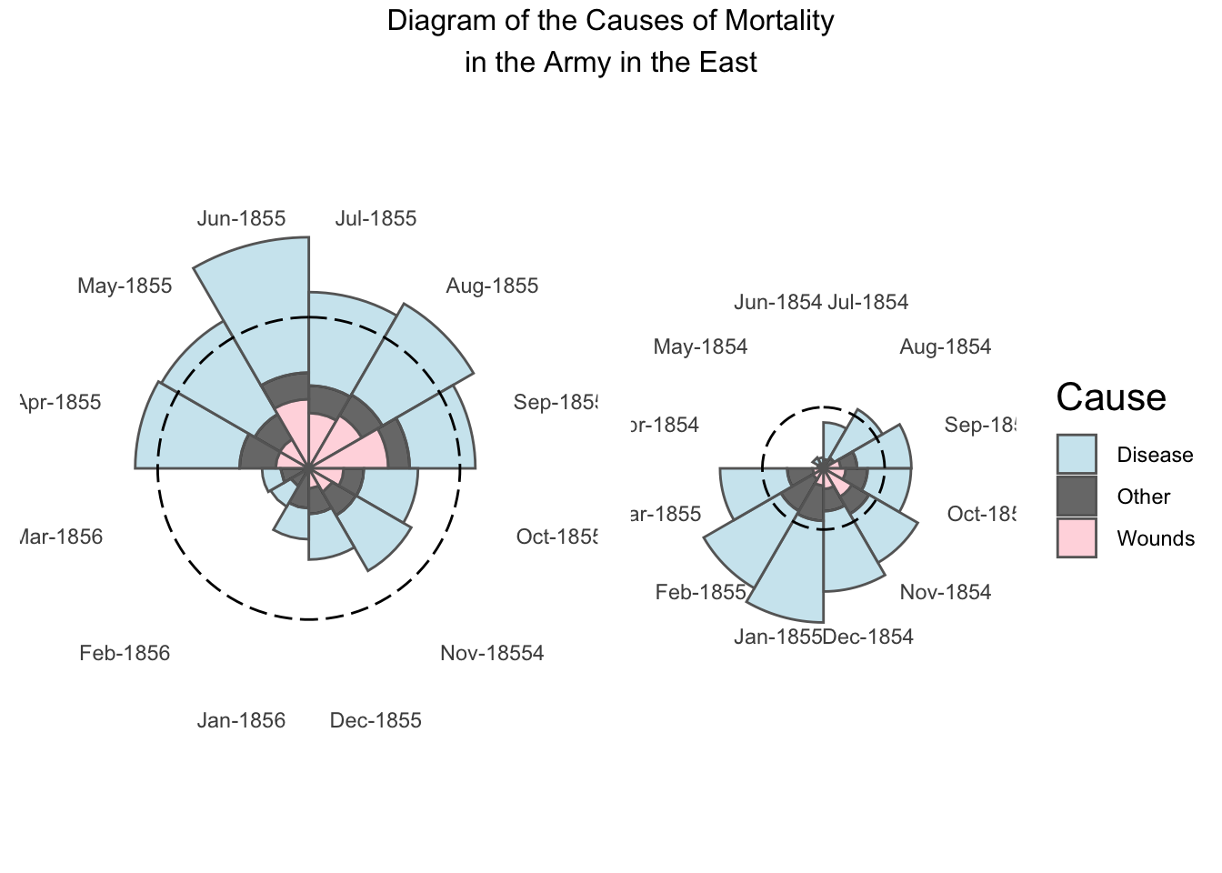
Modern graphing software can try to do the Nightingale coxcomb plot we saw in class—on wikipedia here—but you’ll see that it doesn’t quite look as nice as hers.

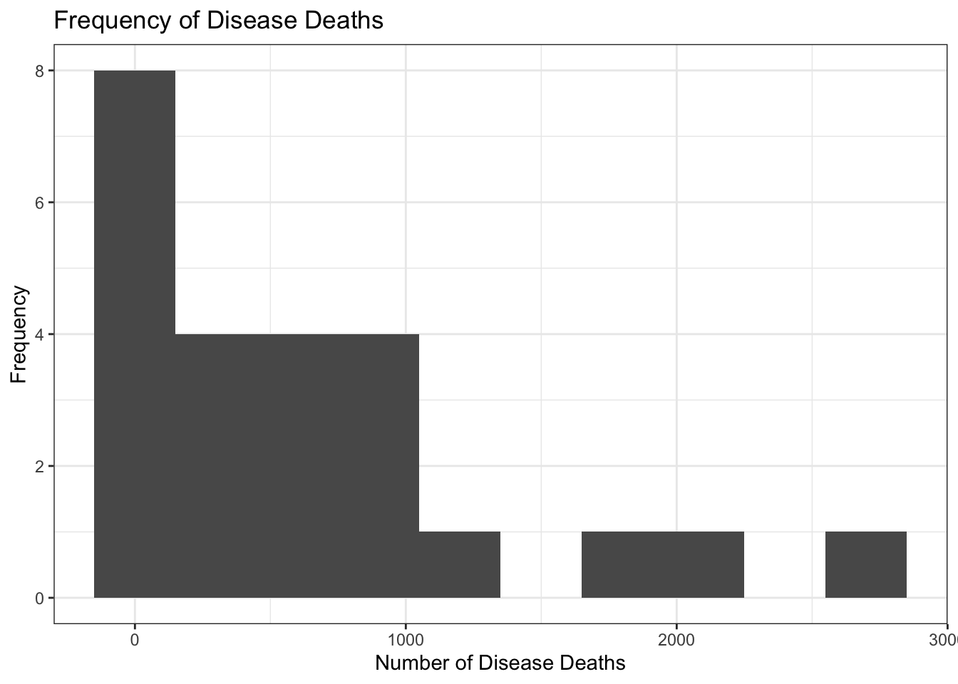
Jamovi can’t do a plot like this, but what it can do quite easily is create a histogram.
- Create a histogram using the full Disease data. Note that this histogram should only involve the disease data—a histogram shows frequencies of how often you get a certain response. Is the data normally distributed? How do you know? Answer these last two questions as part of your answer sheet, #1. Your plot should look something like this (although it might not have the title):

Create a histogram of the deaths from Wounds in the Nightingale data. Is that one normally distributed?
Okay, let’s make a scatterplot. This kind of plot compares two variables to one another—plotting one on the x-axis and the other on the y-axis. There are a few ways to do this in Jamovi, but we’ll use one that’s straightforward to carry out. Under the Analyses ribbon in Jamovi, all the way to the right, hit the plus sign that is labeled “Modules” and then select “jamovi Library.” You’ll want to install the module “scatr”. Then, you should be able to select it under Modules. Go to Modules: scatr: Scatterplot.
Plot deaths from Wounds against those from Disease. It’s up to you which is on the x-axis and which on the y. Add Year into the Group box. Can you draw any conclusions from this?
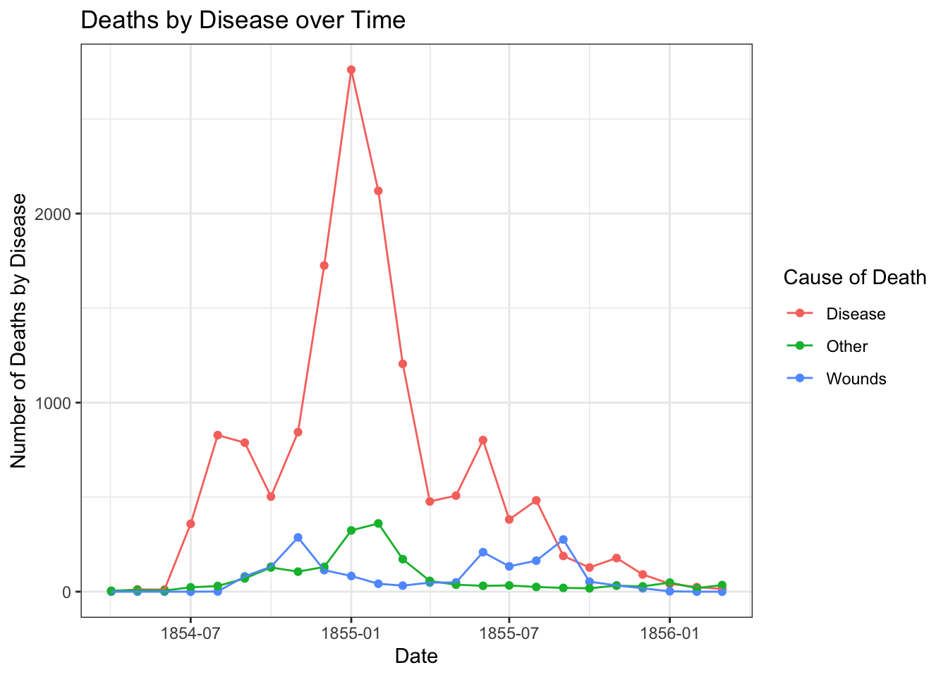
Suppose you wanted to plot cause of death over time for the entirety of the data we have… Line graphs like this are more challenging in Jamovi, but you could actually make it in Google/Excel. In this case, I’ll just include the plot below. Take a look.

- What conclusions do you draw from this figure? How does it compare to the Nightingale coxcomb diagram above? Include this answer as #2 in your answer sheet.
Teaching and Learning Research
Fiorella & Mayer (2013) hypothesized that students would learn course material better if they thought they were going to later be asked teach the material to the rest of the class. To test this, the researchers divided students into three groups. All groups read a short excerpt about the Doppler effect and were later given a 10-question quiz. The control group studied the excerpt and then immediately took the quiz. The preparation group was instructed that they would later teach the material to a group of students. This group studied the excerpt then immediately took the quiz. Finally, the teaching group was instructed that they would later teach the material to a group of students. This group studied the excerpt, taught it to a group of students, and then took the quiz. Fiorella & Mayer reported the following results:
| Group | n | Comprehension score | |
|---|---|---|---|
| M | SD | ||
| Control | 31 | 6.2 | 3.3 |
| Preparation | 32 | 7.9* | 2.4 |
| Teaching | 30 | 8.7* | 2.8 |
* Significantly different from control group at p < .05
We’re going to plot these in a bar graph. Open Excel or Google Sheets and copy them into a table. Before doing anything else, delete the asterisks in your copied data.
Move the n (sample size) values to the far right column, and then delete the empty column that remains. Now, column A should be group, column B should be means, column C SD, and column D should be sample size.
Calculate the standard error of the mean or SEM in column E for each group. Remember that \(\textrm{SEM}=\frac{SD}{\sqrt{n}}\). In S/E, remember that an equation starts with
=and then refers to the cell names. Square roots are gotten by writing outSQRT(). In cell E7, calculate the average of your SEMs using the=AVERAGE()formula. Your answer should be 0.50938.Select the cells representing the names of the groups (i.e., Control, Preparation, Teaching) and the means (6.2, 7.9, 8.7). This should be cells A3:B5.
In Excel, go to the Insert menu, then Chart, then Column. In Sheets, go to Insert, then click Chart. Then from the dropdown menu at the top be sure that “Column Chart” is selected. Both should make a chart that compares the means and add labels on the x-axis. Do they?
This part I want you to figure out how to do: give the graph a title, label the y-axis, and explore other possible settings. You can probably get to settings for it by double-clicking on it or right-clicking.
Add the error bars we calculated: this works correctly in Excel, but in Sheets we’ll need to only do it halfway.
In Excel: go to Add Chart Element: Error Bars: More Error Bars Options. Click on the picture of a column chart in the menu, and change “Error Amount” to Custom. Specify the values in E3:E5 as both positive and negative error values.
In Google Sheets: After double-clicking on the chart, drop down the “Series” menu. At the bottom of it, check the Error Bars checkbox. Change Type from percent to Constant. Set the value to the average value of the SEM that we calculated above. (Google Sheets won’t let you have different error bars for different bars.)
Submit the plot as part of your Brightspace answer sheet, #3. Chat with a neighbor about what is “lost” by doing this in Sheets vs. Excel.
Draw a conclusion from the graph, using the error bars for information. Which method of instruction results in the best scores? What information from the graph makes you feel more confident in that conclusion? Write this answer as #4 on your answer sheet.
Friends data
Okay, now let’s talk about the data from your class (and maybe a few friends). This data is… not a huge sample. Here’s what the beginning of the data looks like (note that you can scroll to the right):
| StartDate | EndDate | Status | Progress | Duration (in seconds) | Finished | RecordedDate | ResponseId | DistributionChannel | UserLanguage | socialmedia | gender | siblings | smed.hrs | gram.followers | fbfriends | tiktokFollow | tvhours | haircolor | belief.in.god | liveoncampus | numclasses | hs_students | firstjobage | covidtimes | eatmeat | operas | cigarettes | like.dance | shakespeare | voting | expectedoutcome_1 | expectedoutcome_5 | expectedoutcome_2 | expectedoutcome_3 | expectedoutcome_4 | majordiv | hrs.sleep | height.unvalidated | shootingdrills | handedness |
|---|---|---|---|---|---|---|---|---|---|---|---|---|---|---|---|---|---|---|---|---|---|---|---|---|---|---|---|---|---|---|---|---|---|---|---|---|---|---|---|---|
| 2023-09-06 12:40:41 | 2023-09-06 12:44:41 | 0 | 100 | 240 | 1 | 2023-09-06 12:44:45 | R_0C9ROSsnnmnKdnX | anonymous | EN | 14 | woman | 1 | 4.0 | 1166 | NA | 2000 | 6 | 1 | 2 | 1 | 4 | 600 | 17 | 1 | 1 | 0 | 1 | 20 | 7 | 1 | 50 | 70 | 60 | 60 | 100 | 2 | 9 | 63 | 1 | 2 |
| 2023-09-06 12:00:06 | 2023-09-06 13:49:49 | 0 | 100 | 6583 | 1 | 2023-09-06 13:49:51 | R_1gUfmmQeqEt7oh0 | anonymous | EN | 14 | female | 1 | 2.5 | 958 | NA | 90 | 2 | 1 | 3 | 1 | 4 | 3000 | 18 | 2 | 1 | 2 | 2 | 21 | 1 | 1 | 80 | 40 | 60 | 60 | 100 | 3 | 9 | 65 | 2 | 4 |
| 2023-09-06 13:55:39 | 2023-09-06 14:02:06 | 0 | 100 | 387 | 1 | 2023-09-06 14:02:08 | R_3r1JCjbddBbrI6f | anonymous | EN | 14 | female | 0 | 3.0 | 900 | NA | 100 | 7 | 1 | 1 | 1 | 4 | 250 | 17 | 1 | 1 | 1 | 2 | 19 | 7 | 1 | 30 | 65 | 42 | 36 | 100 | 3 | 8 | 64 | 1 | 5 |
| 2023-09-06 14:03:59 | 2023-09-06 14:08:07 | 0 | 100 | 247 | 1 | 2023-09-06 14:08:08 | R_3qdnIScLYp8Zif7 | anonymous | EN | 14 | Female | 1 | 4.0 | 900 | NA | 200 | 10 | 1 | 2 | 1 | 5 | 1500 | 15 | 1 | 3 | 2 | 2 | 17 | 1 | 1 | 30 | 50 | 49 | 50 | 100 | 4 | 7 | 67 | 1 | 4 |
| 2023-09-06 14:53:34 | 2023-09-06 14:59:09 | 0 | 100 | 335 | 1 | 2023-09-06 14:59:12 | R_123z2qdD8UtsuFz | anonymous | EN | 1 | non-binary | 2 | 0.5 | 104 | NA | NA | 5 | 1 | 1 | 1 | 4 | 900 | 14 | 2 | 3 | 0 | 2 | 21 | 4 | 2 | 86 | 50 | 43 | 70 | 100 | 3 | 7 | 64 | 1 | 4 |
| 2023-09-06 14:55:21 | 2023-09-06 15:02:24 | 0 | 100 | 422 | 1 | 2023-09-06 15:02:25 | R_3e47P4D2BcuRaAh | anonymous | EN | 1 | Non-binary | 1 | 1.0 | 788 | NA | NA | 3 | 1 | 2 | 1 | 4 | 2400 | 17 | 2 | 1 | 1 | 2 | 19 | 3 | 1 | 29 | 71 | 85 | 34 | 98 | 2 | 6 | 70 | 1 | 5 |
Many of you have collected data in Qualtrics before; this is what that data looks like. What you’ll see now is that it isn’t immediately usable.
Go ahead and open the friends data in Jamovi. (If you didn’t download it before, it’s available under data above.) I haven’t edited any of this data yet. Explore the data a bit.
Check to make sure that your data has the values you’d expect. How many rows does it have? You’ll note that the first two rows are extra information. Delete them. How many rows are left? Enter this value on Brightspace as #5 on your answer sheet.
Because these data were imported with text at the top, Jamovi doesn’t automatically know that some are numbers. You’ll have to tell it. Pick two variables you think should be a number. Under Data or Variables, switch it to be continuous (or, possibly, ordinal). Then create a scatterplot, as we did above.
If we want to create a new variable that’s a rough combination of number of instagram followers with number of hours spent on social media, we might create it as a new variable where we divide the first (gram.followers) by the second (smed.hours). Under the Data menu, use the Compute button to do this. Call the new variable something like
social.quotient. (Remember that you can use the/for division.)Find the range of how many students went to respondents’ high schools (
hs_students). Enter it as answer #6.How many different answers for gender are in data? For the moment, just answer “from a computer’s perspective”. Add this as answer #7 From a human’s perspective: well, it depends a bit on how you categorize them? There are some automated ways of dealing with this, but not (unfortunately) ones I know of in Jamovi or Excel/Sheets. Take some time to recode: everything in lower case. Do you put “woman” and “female” together? Probably. There are also two responses that are intentionally not binary without describing themselves as such. This is where some subjectivity comes into data analysis. (Happy to discuss what it means to collect data on gender at another point; I have many thoughts.)
Okay, finally: go back to Analysis: Exploration: Descriptives. Put one of your numeric variables in Variables, and put the cleaned up Gender variable in the Split by box. Turn on a box plot, and check the checkbox to add the Data onto it. Submit this plot as #8.
Play around some more, if you like. Then save your data for youself, and submit the answer sheet. (I don’t need your data, though!)
Reuse
Citation
@online{dainer-best2023,
  author = {Dainer-Best, Justin},
  title = {Visual {Displays} of {Information} {(Lab} 3)},
  date = {2023-09-21},
  url = {https://faculty.bard.edu/jdainerbest/stats/labs//posts/03-visualizations},
  langid = {en}
}